Monday, 15 February 2010

My Overall Summary

This project has been very enjoyable and fun however I am not going to lie and say it has not been difficult. Our media project has had its high and its lows but I believe we created a successful media package (music video and auncillary tasks)

My personal aims for the project were as follows:
  • Create a music video which people would want to watch again and again
  • Create a CD Package and Magazine Advert which broke conventions and was creative

I think we fullfiled these aims:

the music video is experimental and we have balanced the style/effects of the music video with the message and emotion of the song/lyrics. The music video definateley has its improvements e.g. lyp synch needs improving however overall tyhe audience feedback on the music video was positive.

The album package/magazine advert we created broke conventions and was creative. The main criticism from the audience feeddback was that it was not authentic to the gene of the music (pop/folk). I think this is incorrect I believe the media package is authentic to the genre of the music video (experimental) and music. We wanted to create something that was not what you would see on every other album of a pop/folk star, we wanted to be different, we wanted the artists personality to shine through so the audience could relate to her and understand her music.

Our main problems/difficulties was the pocess of filming for our music video, the weather (snow) locations of memebers of the group made it diofficult to organise times and find the right locations to shoot. Our main concern was our artist/model who was unreliable however thanks to one of our memebrs (lauren Widdop) and luck we were able to find a replacement who fitted the role so well and was brilliant.

A further problem was editing the music video, it was a difficult long process which was tedious and at times mind boggling.

Overall, I am pleased with the final project and feel it was a success, but a few things just needed a few minor adjustments.


By Muhammad Patel

Designs For Auncillary Task


We forgot to upload the designs before so we have done that now.


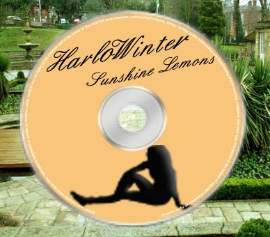
Below are the designs of the album including all four sides and the design of the magazine advert


Album Design:


Magazine Advert Design:


By Muhammad Patel and Lauren Widdop

Thursday, 11 February 2010

My Summary

From the beginning right through to the end, this project has had its definite ups and downs. At the beginning we brainstormed and gathered ideas and images for what we wanted our final product to end up like quite quickly. We shot our first piece of footage (Manchester for the Green Screen) without any problems, then we were stunted when our model was on holiday and then failed to turn up to numerous shootings.

We then had to go through the process of finding a new model, which took quite abit of our time, but then Emily seemed to appear from nowhere! She was a good model to use and helped us along the way, even when we made her pose half naked, or stand in the middle of a road imitating an Egyptian, she stuck it out.

I feel that our group were very organised and we managed to capture our footage with a comfortable amount of time before the deadline.

During the editing we all paid contribution and the video reflects all of our hard work and dedication in it.

I believe that initially, FinalCut is quite a difficult piece of software to get the hang of, but once we found our feet we cruised through our editing.

I am particularly proud of my group because we managed to include a green screen effect which not allot of people in our age range have managed to do. It wasn't as complex as what i expected it to be and would definitly like to give it a go again sometime.

Regrading the ancillary tasks, me and Muhammad experienced quite abit of difficulty because we were inspired by Joss Stone/Paolo Nutini's album covers and had an image in our heads of what we wanted to achieve. I felt that we were a little limited to resources and therefore our cover didn't look as "kitch" as originally planned, but I am overall, extremely happy with it!

Overall, I am overjoyed at the result of our project and feel that the hard work really did pay off.

By Lauren Widdop

Thursday, 4 February 2010

Some Finished Products

Here are some of the album pictures that we have created. All that is left is to decide which pictures we will use for our final product.

By Hannah Tabor and Lauren Pollard

Lily Allen “It’s not me, it’s you”

Whilst producing her second album, Lily Allen decided to head in a new direction. She stated that this change had to occur because, “I did the retro thing last time and since that a lot of other people did it to. I wanted to separate myself from the group and move forward.” Bringing about the birth of her second album “It’s not me, it’s you” which were certified as platinum twice by British Phonographic Industry and 3 times by Australia Recording Industry Association. With the music changing so did her image. Here is her album cover:


The album cover features a number of typical conventions, for example the album title, the artist’s name and an image of the artist. However, although the artist is shown she is not looking at the camera which is unusual for album covers as there is no distinct connection between the artist and her fans. The title of the album, “It’s not me, it’s you”, is in a pink feminine font reflecting her girlie yet independent personality. The use of the black “L” has connations of her being misunderstood with a dark side and maybe some secrets hidden under her confident exterior. Her body language appears carefree and relaxed; this idea is reinforced with the use of the bare feet. By including the netting on her head it indicates some individuality as not many artist feature hair pieces on their album covers. Also, many people believe that if you were some sort of headwear then you are confident. Lily Allen’s album cover not only reflects the music she distributes but also her outspoken personality.


By Hannah Tabor

Wednesday, 3 February 2010

Album Name

We have decided to call the album "sunshine lemons" because it reflects the artist's happy-go-lucky personality and fresh sounding music!


By Muhammad Patel

Tuesday, 2 February 2010

Photos 25/2/2010

On Monday the 25th January 2010 I went to the Corporation park in Blackburn with Emily and my friend Christina. We used all different areas of the park in order to get various shots and settings. Here are all the pictures taken:


By Hannah Tabor

Monday, 1 February 2010

Music Video- Editing Footage update

We have finally finished editing our footage for our music video, we cut up the different shots we needed and juxtaposed them to the music. We have added our effects and changed the texture/colour of some shots to add to the mise on scene/theme of the music video.

However, some of the clips had become pixelated due to how the footage was uploaded using the video camera. So I uploaded the footage again and cut the clips we needed again.


By Muhammad Patel